Thursday, November 4, 2010

The 30 CSS Selectors you Must Memorize

The 30 CSS Selectors you Must Memorize: "


So you learned the base id, class, and descendant selectors – and then called it a day? If so, you’re missing out on an enormous level of flexibility. While many of the selectors mentioned in this article are part of the CSS3 spec, and are, consequently, only available in modern browsers, you owe it to yourself to commit these to memory.


1. *


* {
margin: 0;
padding: 0;
}

Let’s knock the obvious ones out, for the beginners, before we move onto the more advanced selectors.


The star symbol will target every single element on the page. Many developers will use this trick to zero out the margins and padding. While this is certainly fine for quick tests, I’d advise you to never use this in production code. It adds too much weight on the browser, and is unnecessary.


The * can also be used with child selectors.


#container * {
border: 1px solid black;
}

This will target every single element that is a child of the #container div. Again, try not to use this technique very much, if every.


View Demo


2. #X


#container {
width: 960px;
margin: auto;
}

Prefixing the hash symbol to a selector allows us to target by id. This is easily the most common usage, however be cautious when using id selectors.


Ask yourself: do I absolutely need to apply an id to this element in order to target it?


id selectors are rigid and don’t allow for reuse. If possible, first try to use a tag name, one of the new HTML5 elements, or even a pseudo-class.


View Demo


3. .X


.error {
color: red;
}

This is a class selector. The difference between ids and classes is that, with the latter, you can target multiple elements. Use classes when you want your styling to apply to a group of elements. Alternatively, use ids to find a needle-in-a-haystack, and style only that specific element.


View Demo


4. X Y


li a {
text-decoration: none;
}

The next most comment selector is the descendant selector. When you need to be more specific with your selectors, you use these. For example, what if, rather than targeting all anchor tags, you only need to target the anchors which are within an unordered list? This is specifically when you’d use a descendant selector.


Pro-tip – If your selector looks like X Y Z A B.error, you’re doing it wrong. Always ask yourself if it’s absolutely necessary to apply all of that weight.


View Demo


5. X


a { color: red; }
ul { margin-left: 0; }

What if you want to target all elements on a page, according to their type, rather than an id or classname? Keep it simple, and use a type selector. If you need to target all unordered lists, use ul {}.


View Demo


6. X:visited and X:link


a:link { color: red; }
a:visted { color: purple; }

We use the :link pseudo-class to target all anchors tags which have yet to be clicked on.


Alternatively, we also have the :visited pseudo class, which, as you’d expected, allows us to apply specific styling to only the anchor tags on the page which have been clicked on, or visited.


View Demo


7. X + Y


ul + p {
color: red;
}

This is referred to as an adjacent selector. It will select only the element that is immediately proceeded by the former element. In this case, only the first paragraph after each ul will have red text.


View Demo


8. X > Y


div#container > ul {
border: 1px solid black;
}

The difference between the standard X Y and X > Y is that the latter will only select direct children. For example, consider the following markup.


<div id="container">
<ul>
<li> List Item
<ul>
<li> Child </li>
</ul>
</li>
<li> List Item </li>
</ul>
</div>

A selector of #container > ul will only target the uls which are direct children of the div with an id of container. It will not target, for instance, the ul that is a child of the first li.


For this reason, there are performance benefits in using the child combinator. In fact, it’s recommended particularly when working with JavaScript-based CSS selector engines.


View Demo


9. X ~ Y


ul ~ p {
color: red;
}

This sibling combinator is similar to X + Y, however, it’s less strict. While an adjacent selector (ul + p) will only select the first element that is immediately proceeded by the former selector, this one is more generalized. It will select, referring to our example above, any p elements, as long as they are followed by a ul.


View Demo


10. X[title]


a[title] {
color: green;
}

Referred to as an attributes selector, in our example above, this will only select the anchor tags that have a title attribute. Anchor tags which do not will not receive this particular styling. But, what if you need to be more specific? Well…


View Demo


11. X[href='foo']


a[href='http://net.tutsplus.com'] {
color: #1f6053; /* nettuts green */
}

The snippet above will style all anchor tags which link to http://net.tutsplus.com; they’ll receive our branded green color. All other anchor tags will remain unaffected.


Note that we’re wrapping the value in quotes. Remember to also do this when using a JavaScript CSS selector engine. When possible, always use CSS3 selectors over unofficial methods.


This works well, though, it’s a bit rigid. What if the link does indeed direct to Nettuts+, but, maybe, the path is nettuts.com rather than the full url? In those cases we can use a bit of the regular expressions syntax.


View Demo


12. X[href*='nettuts']


a[href*='tuts'] {
color: #1f6053; /* nettuts green */
}

There we go; that’s what we need. The star designates that the proceeding value must appear somewhere in the attribute’s value. That way, this covers nettuts.com, net.tutsplus.com, and even tutsplus.com.


Keep in mind that this is a broad statement. What if the anchor tag linked to some non-Envato site with the string tuts in the url? When you need to be more specific, use ^ and &, to reference the beginning and end of a string, respectively.


View Demo


13. X[href^='http']


a[href^='http'] {
background: url(path/to/external/icon.png) no-repeat;
padding-left: 10px;
}

Ever wonder how some websites are able to display a little icon next to the links which are external? I’m sure you’ve seen these before; they’re nice reminders that the link will direct you to an entirely different website.


This is a cinch with the carat symbol. It’s most commonly used in regular expressions to designate the beginning of a string. If we want to target all anchor tags that have a href which begins with http, we could use a selector similar to the snippet shown above.


Notice that we’re not searching for http://; that’s unnecessary, and doesn’t account for the urls that begin with https://.


Now, what if we wanted to instead style all anchors which link to, say, a photo? In those cases, let’s search for the end of the string.


View Demo


14. X[href$='.jpg']


a[href$='.jpg'] {
color: red;
}

Again, we use a regular expressions symbol, $, to refer to the end of a string. In this case, we’re searching for all anchors which link to an image — or at least a url that ends with .jpg. Keep in mind that this certainly won’t work for gifs and pngs.


View Demo


15. X[data-*='foo']


a[data-filetype='image'] {
color: red;
}

Refer back to number eight; how do we compensate for all of the various image types: png, jpeg,jpg, gif? Well, we could create multiple selectors, such as:


a[href$='.jpg'],
a[href$='.jpeg'],
a[href$='.png'],
a[href$='.gif'] {
color: red;
}

But, that’s a pain in the butt, and is inefficient. Another possible solution is to use custom attributes. What if we added our own data-filetype attribute to each anchor that links to an image?


<a href="path/to/image.jpg" data-filetype="image"> Image Link </a>

Then, with that hook in place, we can use a standard attributes selector to target only those anchors.


a[data-filetype='image'] {
color: red;
}

View Demo


16. X[foo~='bar']


a[data-info~='external'] {
color: red;
}

a[data-info~='image'] {
border: 1px solid black;
}

Here’s a special one that’ll impress your friends. Not too many people know about this trick. The tilda (~) symbol allows us to target an attribute which has a spaced-separated list of values.


Going along with our custom attribute from number nine, above, we could create a data-info attribute, which can receive a space-separated list of anything we need to make note of. In this case, we’ll make note of external links and links to images — just for the example.


"<a href="path/to/image.jpg" data-info="external image"> Click Me, Fool </a>

With that markup in place, now we can target any tags that have either of those values, by using the ~ attributes selector trick.


/* Target data-info attr that contains the value 'external' */
a[data-info~='external'] {
color: red;
}

/* And which contain the value 'image' */
a[data-info~='image'] {
border: 1px solid black;
}

Pretty nifty, ay?


View Demo


17. X:checked


input[type=radio]:checked {
border: 1px solid black;
}

This pseudo class will only target a user interface element that has been checked - like a radio button, or checkbox. It's as simple as that.


View Demo


18. X:after


The before and after pseudo elements kick butt. Every day, it seems, people are finding new and creative ways to use them effectively. They simply generate content around the selected element.


Many were first introduced to these classes when they encountered the clear-fix hack.


.clearfix:after {
content: '';
display: block;
clear: both;
visibility: hidden;
font-size: 0;
height: 0;
}

.clearfix {
_display: inline-block;
_height: 1%;
}

This hack uses the :after pseudo element to append a space after the element, and then clear it. It's an excellent trick to have in your tool bag, particularly in the cases when the overflow: hidden; method isn't possible.


For another creative use of this, refer to my quick tip on creating shadows.


According to the CSS3 Selectors specification, you should technically use the pseudo element syntax of two colons ::. However, to remain compatible, the user-agent will accept a single colon usage as well.


19. X:hover


div:hover {
background: #e3e3e3;
}

Oh come on. You know this one. The official term for this is user action pseudo class. It sounds confusing, but it really isn't. Want to apply specific styling when a user hovers over an element? This will get the job done!


Keep in mind that older version of Internet Explorer don't respond when the :hover pseudo class is applied to anything other than an anchor tag.


You'll most often use this selector when applying, for example, a border-bottom to anchor tags, when hovered over.


a:hover {
border-bottom: 1px solid black;
}


Pro-tip - border-bottom: 1px solid black; looks better than text-decoration: underline;.


20. X:not(selector)


div:not(#container) {
color: blue;
}

The negation psuedo class is particularly helpful. Let's say I want to select all divs, except for the one which has an id of container. The snippet above will handle that task perfectly.


Or, if I wanted to select every single element (not advised) except for paragraph tags, we could do:


*:not(p) {
color: green;
}

View Demo


21. X::psuedoElement


p::first-line {
font-weight: bold;
font-size: 1.2em;
}

We can use pseudo elements (designated by ::) to style fragments of an element, such as the first line, or the first letter. Keep in mind that these must be applied to block level elements in order to take effect.


A pseudo-element is composed of two colons: ::


Target the First Letter of a Paragraph


p::first-letter {
float: left;
font-size: 2em;
font-weight: bold;
font-family: cursive;
padding-right: 2px;
}

This snippet is an abstraction that will find all paragraphs on the page, and then sub-target only the first letter of that element.


This is most often used to create newspaper-like styling for the first-letter of an article.


Target the First Line of a Paragraph


p::first-line {
font-weight: bold;
font-size: 1.2em;
}

Similarly, the ::first-line pseudo element will, as expected, style the first line of the element only.


'For compatibility with existing style sheets, user agents must also accept the previous one-colon notation for pseudo-elements introduced in CSS levels 1 and 2 (namely, :first-line, :first-letter, :before and :after). This compatibility is not allowed for the new pseudo-elements introduced in this specification.' - Source


View Demo


22. X:nth-child(n)


li:nth-child(3) {
color: red;
}

Remember the days when we had no way to target specific elements in a stack? The nth-child pseudo class solves that!


Please note that nth-child accepts an integer as a parameter, however, this is not zero-based. If you wish to target the second list item, use li:nth-child(2).


We can even use this to select a variable set of children. For example, we could do li:nth-child(4n) to select every fourth list item.


View Demo


23. X:nth-last-child(n)


li:nth-last-child(2) {
color: red;
}

What if you had a huge list of items in a ul, and only needed to access, say, the third to the last item? Rather than doing li:nth-child(397), you could instead use the nth-last-child pseudo class.


This technique works almost identically from number sixteen above, however, the difference is that it begins at the end of the collection, and works its way back.


View Demo


24. X:nth-of-type(n)


ul:nth-of-type(3) {
border: 1px solid black;
}

There will be times when, rather than selecting a child, you instead need to select according to the type of element.


Imagine mark-up that contains five unordered lists. If you wanted to style only the third ul, and didn't have a unique id to hook into, you could use the nth-of-type(n) pseudo class. In the snippet above, only the third ul will have a border around it.


View Demo


25. X:nth-last-of-type(n)


ul:nth-last-of-type(3) {
border: 1px solid black;
}

And yes, to remain consistent, we can also use nth-last-of-type to begin at the end of the selectors list, and work our way back to target the desired element.


26. X:first-child


ul li:first-child {
border-top: none;
}

This structural pseudo class allows us to target only the first child of the element's parent. You'll often use this to remove borders from the first and last list items.


For example, let's say you have a list of rows, and each one has a border-top and a border-bottom. Well, with that arrangement, the first and last item in that set will look a bit odd.


Many designers apply classes of first and last to compensate for this. Instead, you can use these pseudo classes.


View Demo


27. X:last-child


ul > li:last-child {
color: green;
}

The opposite of first-child, last-child will target the last item of the element's parent.


Example


Let's build a simple example to demonstrate one possible use of these classes. We'll create a styled list item.


Markup


<ul>
<li> List Item </li>
</ul>

Nothing special here; just a simple list.


CSS


ul {
width: 200px;
background: #292929;
color: white;
list-style: none;
padding-left: 0;
}

li {
padding: 10px;
border-bottom: 1px solid black;
border-top: 1px solid #3c3c3c;
}

This styling will set a background, remove the browser-default padding on the ul, and apply borders to each li to provide a bit of depth.


Styled List


To add depth to your lists, apply a border-bottom to each li that is a shade or two darker than the li's background color. Next, apply a border-top which is a couple shades lighter.


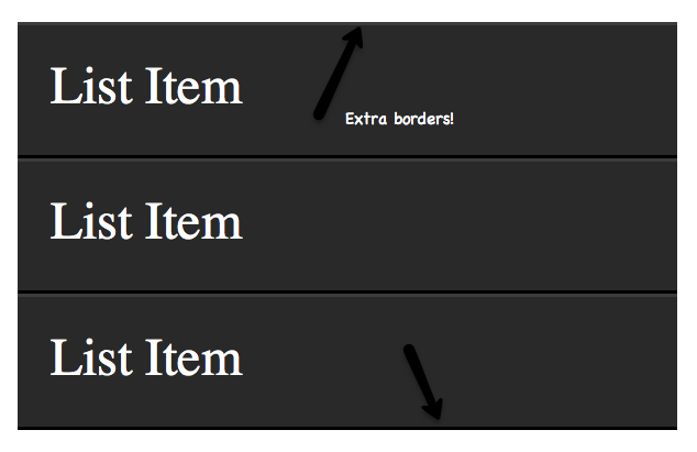
The only problem, as shown in the image above, is that a border will be applied to the very top and bottom of the unordered list - which looks odd. Let's use the :first-child and :last-child pseudo classes to fix this.


li:first-child {
border-top: none;
}

li:last-child {
border-bottom: none;
}


Fixed

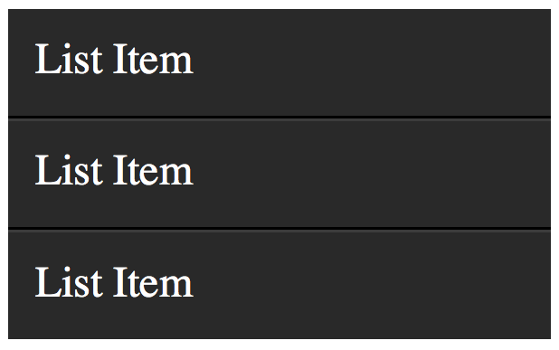
There we go; that fixes it!


View Demo


28. X:only-child


div p:only-child {
color: red;
}

Truthfully, you probably won't find yourself using the only-child pseudo class too often. Nonetheless, it's available, should you need it.


It allows you to target elements which are the only child of its parent. For example, referencing the snippet above, only the paragraph that is the only child of the div will be colored, red.


Let's assume the following markup.


<div><p> My paragraph here. </p></div>

<div>
<p> Two paragraphs total. </p>
</div>

In this case, the second div's paragraphs will not be targeted; only the first div. As soon as you apply more than one child to an element, the only-child pseudo class ceases to take effect.


View Demo


29. X:only-of-type


li:only-of-type {
font-weight: bold;
}

This structural pseudo class can be used in some clever ways. It will target elements that do not have any siblings within its parent container. As an example, let's target all uls, which have only a single list item.


First, ask yourself how you would accomplish this task? You could do ul li, but, this would target all list items. The only solution is to use only-of-type.


ul > li:only-of-type {
font-weight: bold;
}

View Demo


30. X:first-of-type


The first-of-type pseudo class allows you to select the first siblings of its type.


A Test


To better understand this, let's have a test. Copy the following mark-up into your code editor:


<div>
<p> My paragraph here. </p>
<ul>
<li> List Item 1 </li>
<li> List Item 2 </li>
</ul>

<ul>
<li> List Item 3 </li>
<li> List Item 4 </li>
</ul>
</div>

Now, without reading further, try to figure out how to target only 'List Item 2'. When you've figured it out (or given up), read on.


Solution 1


There are a variety of ways to solve this test. We'll review a handful of them. Let's begin by using first-of-type.


ul:first-of-type > li:nth-child(2) {
font-weight: bold;
}

This snippet essentially says, 'find the first unordered list on the page, then find only the immediate children, which are list items. Next, filter that down to only the second list item in that set.


Solution 2


Another option is to use the adjacent selector.


p + ul li:last-child {
font-weight: bold;
}

In this scenario, we find the ul that immediately proceeds the p tag, and then find the very last child of the element.


Solution 3


We can be as obnoxious or as playful as we want with these selectors.


ul:first-of-type li:nth-last-child(1) {
font-weight: bold;
}

This time, we grab the first ul on the page, and then find the very first list item, but starting from the bottom! :)


View Demo


Conclusion


If you're compensating for older browsers, like Internet Explorer 6, you still need to be careful when using these newer selectors. But, please don't let that deter you from learning these. You'd be doing a huge disservice to yourself.


Secondly, when working with JavaScript libraries, like the popular jQuery, always try to use these native CSS3 selectors over the library's custom methods/selectors, when possible. It'll make your code faster, as the selector engine can use the browser's native parsing, rather than its own.


Thanks for reading, and I hope you picked up a trick or two!


"

Thursday, October 28, 2010

Home - Gradle

Interesting project tool: Home - Gradle

Monday, October 18, 2010

Send email using Gmail as a free SMTP with Java Mail

This has bugged me forever. No more!


This can be simplified to be tested with a Linux sendmail server or Apache James on Windows. Just make sure you test this on a network that won't block your test calls otherwise you'll go crazy trying to debug and won't find a problem in your code or configuration. Also make sure to poke the right holes through your firewall.

Excellent syntax highlighting for websites and blogs!

http://alexgorbatchev.com/SyntaxHighlighter/

Wednesday, October 13, 2010

Usability Resources to Win Arguments

Usability Resources to Win Arguments: "

thumbToday’s post is a big one and it’s most definitely one for your bookmarks menu, because from time to time when speaking with clients it becomes necessary to have material to backup the statements which you are making.

Sometimes clients will suggest things such as forcing all users to register with a six page long form before they can even access the site. They aren’t web professionals, it’s not their fault for not knowing that this isn’t a good idea from a usability perspective.

If you’re going to convince them that this is a bad idea, however, then you’re going to need some rock solid material to back that up. While an element of trust is always important to a working relationship, you have to respect that sometimes clients will just need to see the facts in front of them to fully understand that what you’re saying is correct.

So, what we’ve done for you today is compiled a list of some of the biggest, most compelling usability articles which address common issues. Hopefully this should help you during tough conversations about what does and doesn’t work on a a website.

Bookmark this post, come back to it, use it in meetings and educate your clients on the things which work for other websites, so that they might also work for them.

How Not Forcing Users to Register Increased Sales by $300million

1

A truly fascinating article covering how one ecommerce site removed forced user-registration during the checkout process, with a result of a $300million increase in revenue. Very impressive.


10 Useful Usability Findings and Guidelines

2

  • Form labels work best above the field
  • Users focus on faces
  • Quality of design is an indicator of credibility
  • Most users do know how to scroll
  • Blue is the best color for links
  • The ideal search box is 27 characters wide
  • White space improves comprehension
  • Effective user testing doesn’t have to be extensive
  • Informative product pages stand out
  • Most users are blind to advertising


Browser Resolution Stats by Google

3

A big diagram by google showing browsers sizes overlaid on top of a web page and where you should place call to actions to ensure that they are immediately visible without the need to scroll.


The myth of the page fold: evidence from user testing

4

“People tell us that they don’t mind scrolling and the behaviour we see in user testing backs that up. We see that people are more than comfortable scrolling long, long pages to find what they are looking for. A quick snoop around the web will show you successful brands that are not worrying about the fold either.”


247 web usability guidelines

5

A massive post of usability articles covering:

  • Home page usability: 20 guidelines to evaluate the usability of home pages.
  • Task orientation: 44 guidelines to evaluate how well a web site supports the users tasks.
  • Navigation and IA: 29 guidelines to evaluate navigation and information architecture.
  • Forms and data entry: 23 guidelines to evaluate forms and data entry.
  • Trust and credibility: 13 guidelines to evaluate trust and credibility.
  • Writing and content quality: 23 guidelines to evaluate writing and content quality.
  • Page layout and visual design: 38 guidelines to evaluate page layout and visual design.
  • Search usability: 20 guidelines to evaluate search.
  • Help, feedback and error tolerance: 37 guidelines to evaluate help, feedback and errors


An Introduction to Using Patterns in Web Design

6

A fascinating article covering the use of patterns for usability in web design, or “chunks” as the author calls them!


F-Shaped Pattern For Reading Web Content

7

Eye-tracking visualizations show that users often read Web pages in an F-shaped pattern: two horizontal stripes followed by a vertical stripe.


Top Ten Mistakes in Web Design

8

The ten most egregious offenses against users. Web design disasters and HTML horrors are legion, though many usability atrocities are less common than they used to be.


Weblog Usability: The Top Ten Design Mistakes

9

Blogs are often too internally focused and ignore key usability issues, making it hard for new readers to understand the site and trust the author.


Top-10 Application-Design Mistakes

10

Application usability is enhanced when users know how to operate the UI and it guides them through the workflow. Violating common guidelines prevents both.


Mega Drop-Down Navigation Menus Work Well

11

Big, two-dimensional drop-down panels group navigation options to eliminate scrolling and use typography, icons, and tooltips to explain the user’s choices.


10 Usability Crimes You Really Shouldn’t Commit

12

A big post by Chris Spooner covering forms, logo links, link states, alt attributes, background images, content, link text and text alignment.


101 Five-Minute Fixes to Incrementally Improve Your Web Site

13

An absolutely huge post covering quick improvements for usability across so many different levels. This is great one for picking out things that your client’s site might need to have done to it!


Blasting the Myth of the Fold

14

Another article slamming the idea that nothing below the fold ever gets seen. Users know how to scroll. The fold is relevant for a few things, but it is not the be-all and end-all.


UX Myths

15

A great site which is regularly updated with a list of (sometimes funny) myths of user experience issues, these include things such as “all pages should be accessible in 3 clicks” and “the home page is your more important one”.


Eyetracking points the way to effective news article design

16

Real eye tracking tests carried out and showing interesting results with regards to the effectiveness of laying out new articles and blog posts.


Label Placement in Forms

17

A detailed case study showing that the optimum placement for label forms is to the top-right of the form field.


12 Standard Screen Patterns

18

A great rouncup of some standard screen layouts which may pursuade clients away from spherical invisible navigation, or similar.


“Mad Libs” Style Form Increases Conversion 25-40%

19

This interesting article covers how well forms work when arranged as blanks within sentences rather than simple linear pages.


Breadcrumbs In Web Design: Examples And Best Practices

20

“On websites that have a lot of pages, breadcrumb navigation can greatly enhance the way users find their way around. In terms of usability, breadcrumbs reduce the number of actions a website visitor needs to take in order to get to a higher-level page, and they improve the findability of website sections and pages.”


Inline Validation in Web Forms

21

A study by A List Apart on inline validation in forms with live user videos showing the differences between standard forms vs inline validation.


This post was authored exclusively for WDD by John O’Nolan, a core contributor to the WordPress UI Team, writer and entrepreneur based in Surrey in the United Kingdom. John loves to talk to people, so why not follow @JohnONolan on twitter too?

What about you? Do you have any really great articles like these which you think would be a good addition to the list? Drop us a line in the comments below so that everyone can benefit from them!


If you find an exclusive RSS freebie on this feed or on the live WDD website, please use the following code to download it: H0Oa9C

Source

"

Tuesday, October 5, 2010

Finding all class declarations in an HTML document

I was charged with the ever so tedious task of removing all class declarations from XHTML documents. In order to find them it took me a while to find the proper general expression. I'm not regexp-litterate. Here's the explained result:

 (class|styleClass)=\"[^\"]+\"

It means find a string with the following properties:

  • Starts with a space character (granted, this may not catch all cases, but you can tweak it).
  • Then look for "class" or "styleClass", which is a way to declare it in JSF
  • Now an "=" and double quotes
  • Followed by anything except double quotes (this keeps it from including the subsequent attributes in the find)
  • Ends in double quotes

Thursday, July 8, 2010

30+ Very Useful HTML5 Tutorials, Techniques and Examples for Web Developers

Looked too useful to not have around:

30+ Very Useful HTML5 Tutorials, Techniques and Examples for Web Developers: "
html5tutorials

HTML5 is being developed as the next major revision of HTML (HyperText Markup Language). The major market and internet leaders are already switching to the HTML 5 platform. With Apple and Google both pushing the standards in order to facilitate more advanced web development, we should see HTML 5 implementations popping up in the next year or two as more companies get on board with the advanced features.

With the constant drop of Flash usage in web and internet applications, HTML5 is opening new doors to web designers and developers. In this scenario, it is indeed imperative for every web developer to know about basic tutorials, tricks and terms of HTML5.

Here we present before you, a comprehensive list of more than 30 HTML5 tutorials and techniques that you can’t afford to miss if you are a web developer.


Create Offline Web Application On Mobile Devices With HTML5


image

A comprehensive article from the technical library of IBM by IT Architect Dietmar Krueger. In this article, the author describes and explains how challenging it i s to write application for operating systems and mobile platforms. Instead of relying on learning the platform specific languages like Objective-C with Cocoa (on iPhone), the author takes the open way of developing things through HTML5. A very clearly explained and in-depth article.

HTML 5 Demos and Examples


image

HTML 5 experimentation and demos I’ve hacked together. Click on the browser support icon or the technology tag to filter the demos (the filter is an OR filter).

WTF is HTML5


image

One page overview of HTML5 – very useful!

Building a live news blogging system in PHP, Spiced with HTML5


image


This tutorial show you how to build a news website in HTML5 and CSS3. Every line of code is explained for both HTML and CSS

Designing A Blog With HTML5


image

Much of HTML 5’s feature set involves JavaScript APIs that make it easier to develop interactive web pages but there are a slew of new elements that allow you extra semantics in your conventional Web 1.0 pages. This tutorial investigate these by setting u a blog layout.

Semantics in HTML 5


image

HTML 5, the W3C’s recently redoubled effort to shape the next generation of HTML, has, over the last year or so, taken on considerable momentum. It is an enormous project, covering not simply the structure of HTML, but also parsing models, error-handling models, the DOM, algorithms for resource fetching, media content, 2D drawing, data templating, security models, page loading models, client-side data storage, and more.

There are also revisions to the structure, syntax, and semantics of HTML, some of which Lachlan Hunt covered in “A Preview of HTML 5.”

In this article, let’s turn solely to the semantics of HTML. It’s something the author has been interested in for many years, and something which he believe is fundamentally important to the future of HTML.

HTML5 Web Applications


image

HTML 5 browser compatibility overview.

Dive into HTML5


image

Dive Into HTML 5 seeks to elaborate on a hand-picked Selection of features from the HTML5 specification and other fine Standards. I shall publish Drafts periodically, as time permits. Please send feedback. The final manuscript will be published on paper by O’Reilly, under the Google Press imprint. Pre-order the printed Work and be the first in your Community to receive it.

When Can I Use


image

Here you will find very useful compatibility tables for features in HTML5, CSS3, SVG and other upcoming web technologies.


HTML5 & CSS3 Readiness


image

How to Draw with HTML 5 Canvas


image


Among the set of goodies in the HTML 5 specification is Canvas which is a way to programmatically draw using JavaScript. We’ll explore the ins and outs of Canvas in this article, demonstrating what is possible with examples and link

Have a Field Day with HTML5 Forms


image

Forms are usually seen as that obnoxious thing we have to markup and style. I respectfully disagree: forms (on a par with tables) are the most exciting thing we have to work with.

Here we’re going to take a look at how to style a beautiful HTML5 form using some advanced CSS and latest CSS3 techniques. I promise you will want to style your own forms after you’ve read this article.

Coding Up a Web Design Concept into HTML5


image

Code a Backwards Compatible, One Page Portfolio with HTML5 and CSS3


image

HTML5 is the future of web development but believe it or not you can start using it today. HTML5 is much more considerate to semantics and accessibility as we don’t have to throw meaningless div’s everywhere. It introduces meaningful tags for common elements such as navigations and footers which makes much more sense and are more natural.

This is a run through of the basics of HTML5 and CSS3 while still paying attention to older browsers. Before we start, make note of the answer to this question.

Coding A HTML 5 Layout From Scratch


image

While it is true HTML5 and CSS3 are both a work in progress and is going to stay that way for some time, there’s no reason not to start using it right now. After all, time’s proven that implementation of unfinished specifications does work and can be easily mistaken by a complete W3C recommendation. That’s were Progressive Enhancement and Graceful Degradation come into play.

How to Make an HTML5 iPhone App


image

You’ve been depressed for like a year now, I know. All the hardcore Objective-C developers have been having a hay-day writing apps for the iPhone. You might have even tried reading a tutorial or two about developing for the iPhone, but its C—or a form of it—and it’s really hard to learn.

You can also do it with the skill set you probably already have: HTML(5), CSS, and JavaScript.

This tutorial show you how to create an offline HTML5 iPhone application. More specifically, I’ll walk you through the process of building a Tetris game.

Create An Elegant Website With HTML 5 And CSS3


image

Learn five macro-steps to build an effective website using brain, pencil, paper, Photoshop, HTML and CSS. But technology doesn’t stop, luckily, and we have other two great allies for the future to design better website: HTML 5 and CSS3.

Coding a CSS3 & HTML5 One-Page Website Template


image

See how to create a HTML5 web template, using some of the new features brought by CSS3 and jQuery, with the scrollTo plug-in. As HTML5 is still a work in progress, you can optionally download a XHTML version of the template here.

Design & Code a Cool iPhone App Website in HTML5


image

HTML5 is definitely the flavor of the month, with everyone in the design community getting excited about its release. In this tutorial we’ll get a taste of what’s to come by building a cool iPhone app website using a HTML5 structure, and visual styling with some CSS3 effects.

HTML 5 and CSS 3: The Techniques You’ll Soon Be Using


image

In this tutorial, we are going to build a blog page using next-generation techniques from HTML 5 and CSS 3. The tutorial aims to demonstrate how we will be building websites when the specifications are finalized and the browser vendors have implemented them. If you already know HTML and CSS, it should be easy to follow along.

HTML5 for Beginners. Use it now, its easy!


image

HTML5 for Beginners. Use it now, its easy! This article cover some of the HTML5 basics in a funny way…

Rocking HTML5


image

This presentation is an HTML5 website and it is a very informative and easy to use overview of the HTML5 elements.

Building Web Pages With HTML 5


image

Depending on who you ask, HTML 5 is either the next important step toward creating a more semantic web or a disaster that’s going to trap the web in yet another set of incomplete tags and markup soup.

The problem with both sides of the argument is that very few sites are using HTML 5 in the wild, so the theoretical solutions to its perceived problems remain largely untested.

That said, it isn’t hard to see both the benefits and potential hang-ups with the next generation of web markup tools.

HTML5 Cheat Sheet


image

HTML 5 Visual Cheat Sheet is an useful cheat sheet for web designers and developers designed by me. This cheat sheet is essentially a simple visual grid with a list of all HTML tags and of their related attributes supported by HTML versions 4.01 and/or 5. The simple visual style I used to design this sheet allows you to find at a glance everything you are looking for.

html5test.com


image

This is a browser test with a lot of detail. Very useful.

HTML5 Canvas Experiment


image

Time for us to play with this technology. We’ve created a little experiment which loads 100 tweets related to HTML5 and displays them using a javascript-based particle engine. Each particle represents a tweet – click on one of them and it’ll appear on the screen. (click on the image to see it in action)

HTML 5 Cheat Sheet (PDF)


image

html5 Pocketbooks


image

OK You have seen that HTML 5 is here, but should you use it?


Generally I think it depends on the site you are working on. If it is a high traffic commercial website you may want to hold it back a bit. However if it is a personal blog I believe it is time to get started and learn how to use the new features in HTML 5.

Actually HTML5 is used more than you may think already. You should check out the sites featured on HTML 5 Gallery and view source to see what they’re doing. Also there is already a HTML 5 Wordpress theme available.

Other interesting posts on this topic


Feed provided by tripwrire magazine, Visit this post here: Permalink "